.jpg)
And just in case you were wondering what LLC is, the letters stand for Limited Liability Company and it is required by law to have those letters next to the name of the business. Yay! Thank you American legal system.
But how did I come up with the idea to make this logo?
I think the greatest challenge any designer has is to take something that is rather complex and translate that into something much more simple. I learned in school a long time ago that the key to a great icon or logo is the ability to shrink it down to size of your thumbnail and not lose any value of what it stands for. In other words, if you have to explain what each little piece or element of what your logo is to others then you have failed.

So let me rewind back in time to when we started the business. I have always wanted to have my own business buying decorative goods from Thailand and selling them here to the US market ever since my first visit to Thailand way back in 1999. But naming my business "Andrew's Home Decorative Imports from Thailand Business" is just too plain and, to be honest, it's boring and it takes up too much space on a business card or website.
So when it came time to naming my business I wanted to create a name as unique as the products I offer. I also wanted it to appeal to the largest group of people who were most likely to have any interest in my products...women...so I needed a name that was distinctly feminine and also professional and marketable.
After asking for advice from some female friends and colleagues I was sitting in the living room chatting with my wife during a lazy Sunday afternoon throwing some ideas back and forth. She came up with the name Blue Orchid Imports and I liked it. Orchids are not naturally blue; rather, they are more naturally purple in color.
That's one of the primary reasons why I liked the name. Orchids are an essential representation of Thailand. I like that part because it gives credit to the place of origin of all my goods. The process of dying the orchid petal blue is unique. I like that, too. It makes sense that if my decorations and furnishings are of high quality, if they are rare, and if they are unique...then this name suits the business perfectly.
But now comes the hard part
How do I take everything that I have just described and put it into an image that everyone will understand?

Fortunately, for me,
the first step was already done when I named the business.
Why not make your company logo look like a blue orchid?
That's exactly where I started, and thanks to google, I made a quick image search for blue orchids. But, here's the problem. There are, I think quite literally, a million google images of a blue orchid, an arrangement of blue orchids, or something else blue orchid related.
Uh-oh.
So I outsourced it. One of the troubles of being 100 percent involved in 100 percent of your own small business is that you develop a sense of tunnel vision. You can quickly come up with an idea or concept and fall in love with it. And everybody else around you hates it but won't tell you because they love you.

Anyway, I had to take myself out of the project.
I hired a graphic designer who wasn't that far removed from design school. We chatted around for quite a while while I described my back story for my business, and my designer took great notes and even came up with a few sketches.
I think that was one of the best moves I have ever made
Why would a designer hire another designer to make a design? It freed up so much of my time because I wasn't constantly thinking about it like designers do. As a
I paid my designer half of the agreed amount up front at our initial meeting. It showed that I was serious about what I wanted and what I was willing to offer. The second half of the agreed amount would come when the project was complete.
At first I would let her show me some sketches by using email and Dropbox, and I would give feedback as I saw fit. But after a while I could tell that my designer was just too busy with her day job and we just stopped communicating. I also got a little impatient and started to dabble on my own with a few sketches.

So I grabbed my trace paper and went to work. My college professors would be so proud of me because that's what we used to do in class...for everything.

So I tried again.

So I cut the idea of the "popcorn popping" idea and tried to implement something that combined more than one "piece of popcorn."

I was getting closer. Finally, I just went back to the idea of making a flower with the idea of making something round or circular. I wanted to create a sense of wholeness or being complete...and I didn't want anyone to confuse my logo and accidentally turn it upside down.

And I started repeating it a bit until I drew one that I liked. I tried some with a dot in the middle to tie them all together, and then I tried some with nothing holding them in the middle. I liked the latter of the two concepts.
Then I gout out my blue painters tape because that was all that I had with me.

and after some actual cut and pasting...
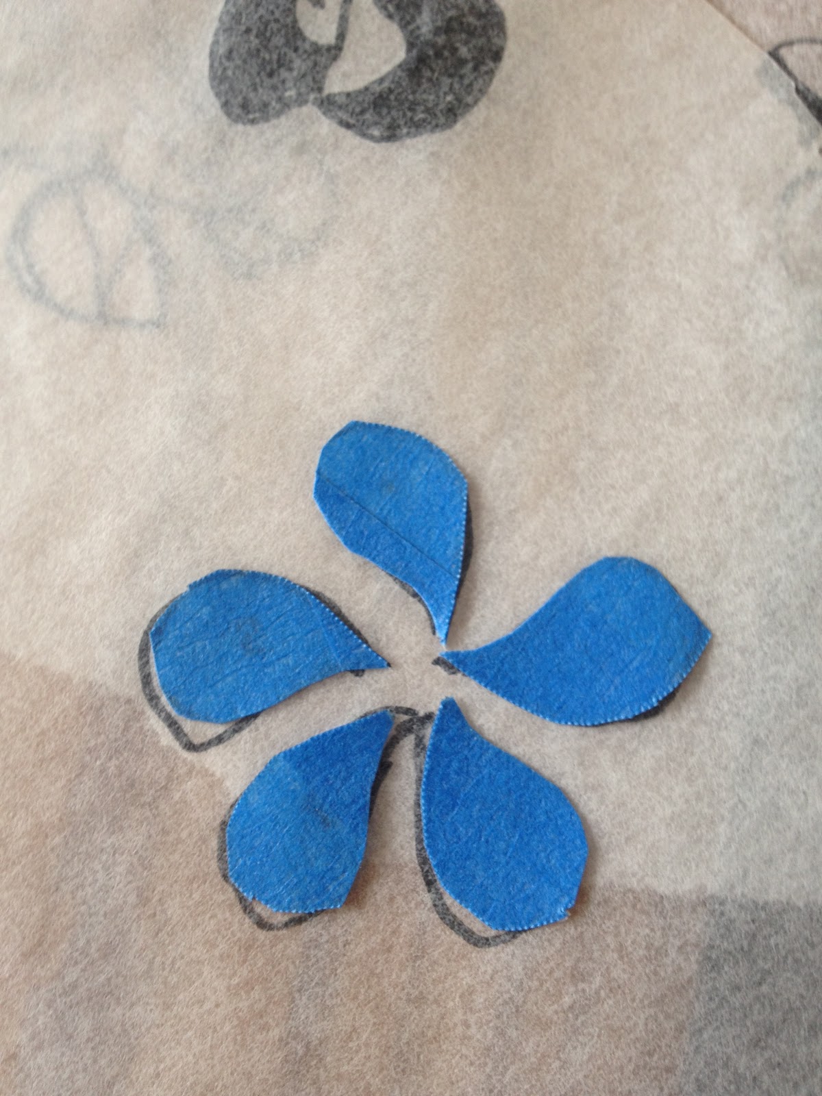
My new logo.
I asked around again on facebook, and nobody said that it was an ink blot test or anything else too vague so I kept the idea.
Then I hired another graphic designer to put on the finishing touches. I don't mind having to pay two designers for the job that I ultimately did by myself. The second designer lives very close by and is a friend of mine. When I showed her my logo image and asked if she could do the final computer work she agreed to finish it off for the remaining amount that I was going to give to the first designer.
And that's the story of how I got my logo.
Lessons learned:
1. I was so right to hire it out. It saved me time. I didn't have to re install Adobe Illustrator onto my computer, I didn't have to refresh my computer skills, and I didn't have get frustrated by making trial and error mistakes.
2. I had the right idea to hire a new designer and give her a chance, but I don't think either one of us realized what we were getting ourselves into. She had a day job to take care of, and I was getting impatient.
3. Ask questions and get lots of feedback, especially if it hurts your feelings. I'm so glad that I didn't keep all of my ideas to myself and make a logo that looks like the devil with his zipper down.
4. I was a little nervous to ask my friend to finish the job because I have a policy with working with friends. It's difficult to tell your friend that she's fired, but I trusted my friend because I have seen her work and I know her personality. It just worked out this time.
5. I stuck to my gut. Whether you call it an instinct, a gut feeling, or anything else stick to that impression. Be willing to try new things, but when all else fails stick to your gut.
Thank You
I give credit where credit is due. Check out the following websites and blogs of people I have referenced:
My wife's blog
my friend's blog
No comments:
Post a Comment